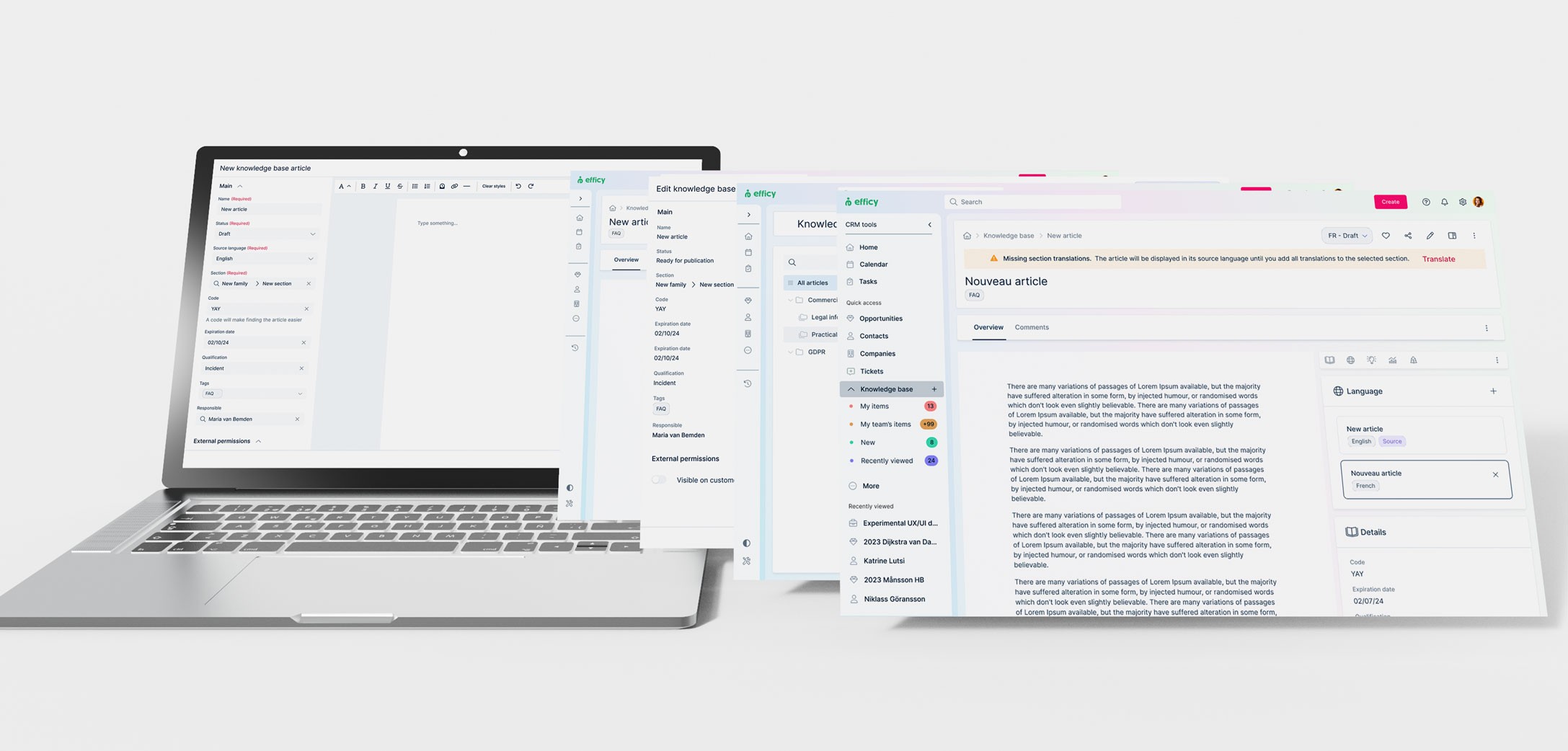
Maxo is a new CRM platform designed for SMBs and large companies. It's been in development since 2019, and towards the end of the project, we began refining the usability of its main features.
As a product designer on the customer service team, I collaborated closely with the product manager to enhance the functionality of the existing knowledge base, improve its usability, and add new features such as localisation and visibility settings.
Keep scrolling for the story or, go straight to the solution.
Team
I was the sole designer on the project and part of the fixed customer service team for Maxo. The team included a product manager for the module, four engineers responsible for development, and one QA engineer.
Time
At efficy, we work in six-week cycles, and this particular project took place during the July-August 2024 cycle.
Tags
PRODUCT DESIGN
UX TESTING
WEB APP
IN-HOUSE


Context
The vision for Maxo's customer service module is to position the product as the go-to solution for organisations looking to elevate their customer service capabilities.
As a new product within an established company, Maxo inherited some features and code from an existing CRM, including a knowledge base. However, the existing solution was incomplete, lacking the crucial functionality and usability needed to achieve the desired vision of seamless support through the customer portal.
As a new product within an established company, Maxo inherited some features and code from an existing CRM, including a knowledge base. However, the existing solution was incomplete, lacking the crucial functionality and usability needed to achieve the desired vision of seamless support through the customer portal.
As a new product within an established company, Maxo inherited some features and code from an existing CRM, including a knowledge base. However, the existing solution was incomplete, lacking the crucial functionality and usability needed to achieve the desired vision of seamless support through the customer portal.
The problem
The foundations for the feature were in place, but nothing worked as it should. This made the knowledge base frustrating for users and far below market standards from a go-to-market standpoint.
Article creation:The side panel used for article creation was restrictive, making it difficult for users properly format and view the text being written.
Folder management: The process for organising articles into folders was unclear and cumbersome.
Localisation and translation: There were no localisation features, which was a significant issue for a product marketed across Europe.
Article lifecycle: The workflow for managing article status was confusing and innacurate.
Visibility management: Users couldn’t manage the visibility of articles in the customer portal, limiting control over what content was accessible to customers.
UX phase
I began by going through the PM's existing competitive research to get acquainted with the market standards.
Zendesk and Freshdesk are efficy's main competitors in the customer service sphere, and they already offer the features we were working towards. I analysed what these platforms had in common and identified areas for improvement to reach a superior solution.
Zendesk and Freshdesk are efficy's main competitors in the customer service sphere, and they already offer the features we were working towards. I analysed what these platforms had in common and identified areas for improvement to reach a superior solution.
Zendesk and Freshdesk are efficy's main competitors in the customer service sphere, and they already offer the features we were working towards. I analysed what these platforms had in common and identified areas for improvement to reach a superior solution.

Our first users for the feature would be our own product adoption agents, who were already using Intercom to write documentation for Maxo.
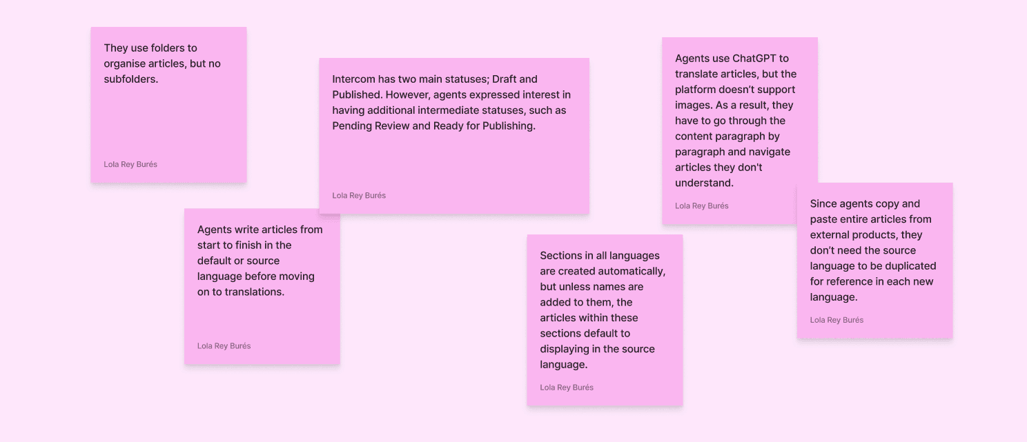
Since the product wasn’t released yet, internal interviews and testing were the best way to gather user feedback. I organized Q&A sessions to better understand our agents’ processes, including how they wrote and translated articles and their usage of Intercom, specifically.
Since the product wasn’t released yet, internal interviews and testing were the best way to gather user feedback. I organized Q&A sessions to better understand our agents’ processes, including how they wrote and translated articles and their usage of Intercom, specifically.
Since the product wasn’t released yet, internal interviews and testing were the best way to gather user feedback. I organized Q&A sessions to better understand our agents’ processes, including how they wrote and translated articles and their usage of Intercom, specifically.

I now had a clear understanding of our users' expectations for the feature and the tasks they needed to accomplish. However, the newest and most complex functionalities still required clarification:
Creation of Families (Folders), Sections (Subfolders), and Articles
Translation of Families (Folders), Sections (Subfolders), and Articles
I diagrammed these user flows and reviewed them with my team to ensure all needs were addressed and to resolve lingering questions, such as:
What purpose does the source language serve?
Is it necessary to have two organisational levels (folders and subfolders)?
Can users create articles in languages the selected section doesn't support? If yes, will the article be shown in the customer portal? If not, how should we warn them and/or direct them to translating the family and section?


Usability testing
Once I had a working prototype, we tested the improved UI and new flows with the same product adoption agents we had interviewed earlier.
This allowed us to gather their feedback on the refreshed design and determine if we had achieved the desired level of functionality and user-friendliness.
Once I had a working prototype, we tested the improved UI and new flows with the same product adoption agents we had interviewed earlier.
This allowed us to gather their feedback on the refreshed design and determine if we had achieved the desired level of functionality and user-friendliness.
Once I had a working prototype, we tested the improved UI and new flows with the same product adoption agents we had interviewed earlier.
This allowed us to gather their feedback on the refreshed design and determine if we had achieved the desired level of functionality and user-friendliness.
Tasks
1- Create a family
2- Create a section
3- Create an article
4- Translate the article
5- Check for missing languages in article's section and family
6- Add missing languages
Learnings
Users understood clearly how to create all object types
Users needed the additional "Add translations" option in the dropdown to translate families and sections, even if the "Edit" option did the same
Status is really important, and users appreciated the granularity of our system
Users navigated through articles and their different languages successfully
The new interface caused great first impressions and was described as "Very clean and user-friendly"
UI phase: The solution
Knowledge base homepage
The feature's main homepage is where users can get an overview of all existing articles, families and sections, as well as each article's status per language and details such as author and qualification.
The feature's main homepage is where users can get an overview of all existing articles, families and sections, as well as each article's status per language and details such as author and qualification.
The feature's main homepage is where users can get an overview of all existing articles, families and sections, as well as each article's status per language and details such as author and qualification.
Creation and translation of families and sections
Users can create these folders from the left tree view in an original or source language, then upon saving they can go on translating them in each item's individual menu.
Users can create these folders from the left tree view in an original or source language, then upon saving they can go on translating them in each item's individual menu.
Users can create these folders from the left tree view in an original or source language, then upon saving they can go on translating them in each item's individual menu.
Creation of articles
Users now have a better view of their written content and an easy-to-use panel for configuration with a new and improved text editor wizard to replace the old side panel.
Creation can start from the global knowledge base view or individual sections. When created from sections, the section field in the wizard will be pre-filled.
Localisation of articles
Once the original or "source" language is created, users have the option to add translations to it from the article's page. From here they can also get an overview of the article's status, existing translations and general configuration, as well as access the article's edit page.
Once the original or "source" language is created, users have the option to add translations to it from the article's page. From here they can also get an overview of the article's status, existing translations and general configuration, as well as access the article's edit page.
Once the original or "source" language is created, users have the option to add translations to it from the article's page. From here they can also get an overview of the article's status, existing translations and general configuration, as well as access the article's edit page.
Key takeaways
There's always room for improvement
While the first version of the feature tested surprisingly well, I believe there are still areas, such as error management, that could be improved. Time and resource related constraints meant caused us to implement an alert system for articles that exist within sections not supporting one or more of the article's existing translations. This solution was faster and more cost-effective, but it adds an extra step to the user flow. Ideally, we could prevent users from creating articles without first translating the selected sections. I plan to build on the design to incorporate this adjustment in the future.
While the first version of the feature tested surprisingly well, I believe there are still areas, such as error management, that could be improved. Time and resource related constraints meant caused us to implement an alert system for articles that exist within sections not supporting one or more of the article's existing translations. This solution was faster and more cost-effective, but it adds an extra step to the user flow. Ideally, we could prevent users from creating articles without first translating the selected sections. I plan to build on the design to incorporate this adjustment in the future.
While the first version of the feature tested surprisingly well, I believe there are still areas, such as error management, that could be improved. Time and resource related constraints meant caused us to implement an alert system for articles that exist within sections not supporting one or more of the article's existing translations. This solution was faster and more cost-effective, but it adds an extra step to the user flow. Ideally, we could prevent users from creating articles without first translating the selected sections. I plan to build on the design to incorporate this adjustment in the future.
There's also always room for dreaming
Looking ahead, the potential for integrating AI into the article translation process, opens up exciting possibilities. I’m considering how AI could be incorporated directly into the object editor to automate the translation step entirely.
Looking ahead, the potential for integrating AI into the article translation process, opens up exciting possibilities. I’m considering how AI could be incorporated directly into the object editor to automate the translation step entirely.
Looking ahead, the potential for integrating AI into the article translation process, opens up exciting possibilities. I’m considering how AI could be incorporated directly into the object editor to automate the translation step entirely.