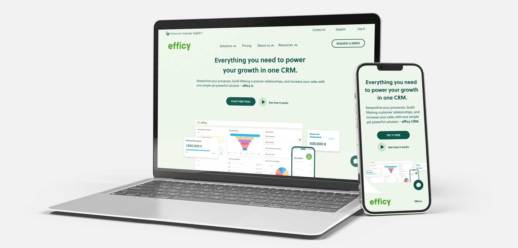
efficy's website was outdated, user-unfriendly, and visually unappealing when the company decided to redesign it.
As a graphic designer in efficy's marketing team, I led all the design stages of the project, from successfully advocating for the importance of user research and testing, to designing the website's UI.
The site has since been reskinned to match a rebranding effort, which I also contributed to, but the original UX from this project remains unchanged. Visit efficy's website or jump to the solution here.
Team
For this project, I took on the role of a UX/UI designer, working alongside a graphic design colleague on the visuals. We collaborated with two webmasters and an engineer for the technical development and with efficy's content strategist for copy writing and proofing.
Time
November 2022 - April 2023
Tags
WEB DESIGN
UX RESEARCH
VISUAL IDENTITY

Context
efficy is a CRM and marketing services provider that has been in the market for over 20 years and has undergone multiple mergers and acquisitions.
The company was restructuring its offering and launching a new SaaS platform. Their website was outdated, inflexible, and difficult to update, so they decided to start from scratch and refresh both its look and content.
To better understand the project's constraints and expectations, I started by interviewing the company's CMO, the main stakeholder, to discuss the company's goals.
This Q&A session revealed the main reasons for wanting a new website:
1. The old website was too focused on the company rather than the value it could provide to users.
2. The offering and package options were being reconfigured, and the old website structure couldn’t properly accommodate these changes.
3. The site looked visually outdated and wasn’t optimised for conversions.
UX phase
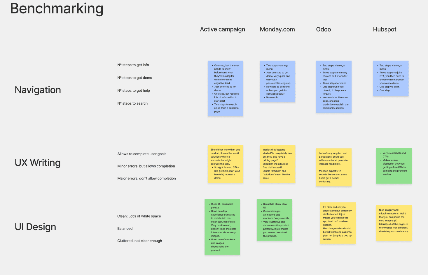
I began by benchmarking competitors' marketing sites to identify existing patterns and best practices.
I then conducted a heuristic assessment of the old site to identify the biggest pain points in user flows and site architecture.
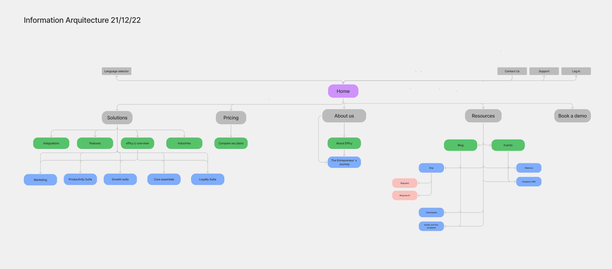
Once these had been flagged, the webmasters and I collaborated on refining the site map.


Wireframes
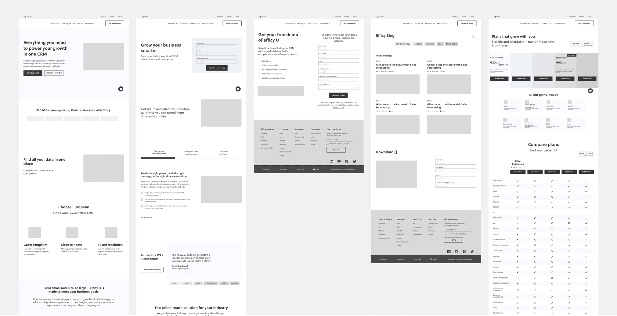
Since more than 50% of efficy's website visitors are desktop users, I decided to prioritise them and make this a desktop first project.
I outlined the main pages of the site and gave key team members, including webmasters, copywriters, and SEO specialists, comment access to the file. This approach allowed them to provide feedback and ensured their involvement in the decision-making process. Given the size of the site and the complexity of the product, it enabled us to quickly iterate and arrive at a first version that everyone was on board with.

Visual design
Along with a another graphic designer, we created a mood board for approval and then visual assets such as icons, images and animations.
By that point, we knew the existing branding would soon be phased out too, so we aimed to create a transitioning visual language that felt fresh while remaining true to the current brand image. This approach resulted in a stark visual difference from the existing website that required several stages of approval and feedback to ensure alignment with the company’s vision.
Having done that, I worked on the UI of the site applying the agreed-upon colour palette and visual assets. I also created a UI kit to assist developers in implementing the designs.

User testing
At that time, the company had a low level of UX maturity; even the in-house product design team did not conduct user interviews or tests.
I presented the CMO with the benefits and competitive advantages of testing the main user flows for the new website and requested a small budget to conduct these tests. Fortunately, he was on board with the idea.
Our deadline for starting site development was mid-January 2023, which left me with just two weeks during the holidays to recruit participants, conduct tests, compile a report, and apply the feedback.
I quickly prototyped the main user flows:
Request a demo of the product
Start a free trial
Find information about the CRM offering
Find information about the MarTech offering
Find information about the company itself
And recruited 5 users who met the screening and demographic criteria for the project. Each participant was given 4 scenarios to complete and alternated between the mobile and desktop versions of the site.
UI phase: The solution
Most users had problems understanding the offering.
Since the package names weren't self explanatory, users had trouble associating them with their needs.
Changing their names wasn’t an option, so I tackled this by turning the menu into a mega, interactive menu, where we could further describe the package options.
The pricing page was most popular.
Users favoured this page above all others, so I enhanced it with customisation features.
Additionally, I restructured the comparison matrix to improve readability and discoverability.
Designing for conversions
A highly interactive and customisable experience, where users can pick and choose from a highly complex offering and build exactly what they need.
We cater to all kinds of customers
Small businesses and startups require a unique approach, as they can often feel out of place in the corporate world.
We created a tailored experience for them, featuring a distinctive look and feel and providing specific instructions on how to get started with a CRM.
Key takeaways
Collaboration is paramount
Effective communication, constant feedback, and sharing are essential for a team to function smoothly and ensure that every project step progresses as planned. Whenever we encountered roadblocks or delays, they often stemmed from a lack of one of these three elements.
User feedback is everything
I felt the project didn’t achieve the desired depth and quality until we tested the prototype and received external feedback. Without this, the website would have felt shallow and unreliable. Learning from users was definitely my favourite part of the project.
Prototyping is a powerful research tool
I previously saw prototyping only as a means to get approval on concepts or improve dev hand off. However, for this project, I used prototypes not only to refine designs but also to enhance our research process by validating assumptions and identifying needs. This experience also taught me a lot about prioritisation; the prototype used for testing this website wasn’t perfect but was sufficient to achieve our goals.