An all-in-one gig + digital marketplace app that lets freelancers turn their portfolios into active services for promotion, while at the same time offering the ability to sell digital products to earn extra income between gigs.
Keep scrolling for the story or, go straight to the solution.
An all-in-one gig + digital marketplace app that lets freelancers turn their portfolios into active services for promotion, while at the same time offering the ability to sell digital products to earn extra income between gigs.
Keep scrolling for the story or, go straight to the solution.
An all-in-one gig + digital marketplace app that lets freelancers turn their portfolios into active services for promotion, while at the same time offering the ability to sell digital products to earn extra income between gigs.
Keep scrolling for the story or, go straight to the solution.
Team
This was a conceptual project I did on my own for a UX/UI bootcamp.
Time
3 months, 2021
Tags
CONCEPTUAL
MOBILE
iOS
PRODUCT DESIGN
BRANDING
Check out the work file for more insight on my process and file structuring.

About the problem
Did you know that at the moment there are approximately 1.100 million freelancers working worldwide?
The coronavirus pandemic caused freelance job offers to go up 40%. Moreover, almost half these job offers came from word-of-mouth recommendations from former customers, which are hard to get if you’re just starting to work as a freelancer.
The coronavirus pandemic caused freelance job offers to go up 40%. Moreover, almost half these job offers came from word-of-mouth recommendations from former customers, which are hard to get if you’re just starting to work as a freelancer.
The coronavirus pandemic caused freelance job offers to go up 40%. Moreover, almost half these job offers came from word-of-mouth recommendations from former customers, which are hard to get if you’re just starting to work as a freelancer.
A striking 72% of freelancers are worried about their unpredictable incomes.
Not only this, but those who have managed to build successful freelance businesses still worry about their sustenance, saving ability and experience guilt when taking vacations.
Not only this, but those who have managed to build successful freelance businesses still worry about their sustenance, saving ability and experience guilt when taking vacations.
Not only this, but those who have managed to build successful freelance businesses still worry about their sustenance, saving ability and experience guilt when taking vacations.
Existing solutions
Platforms like Fiverr, Upwork, and PeoplePerHour successfully provide a space for freelancers to offer their services, but they often prioritise buyers over the freelancers seeking work.
Additionally, freelancers must host their portfolios on one platform and recreate their projects on another in order to promote their work.
The questions of how to handle inexperience and time off were also left unanswered, which made the rise of passive income platforms like Etsy and Creative market even more notable to me.

The opportunity
How can I help freelancers get more jobs and thrive in their profession, while ensuring a steady income during slow periods?
My research narrowed the scope down to these key opportunities:
Provide a unified space where portfolio and service promotion coexist.
Integrate passive revenue into the model.
Help freelancers secure new customers and communicate with them seamlessly.
With this in mind, I came up with these features for the app's MVP:
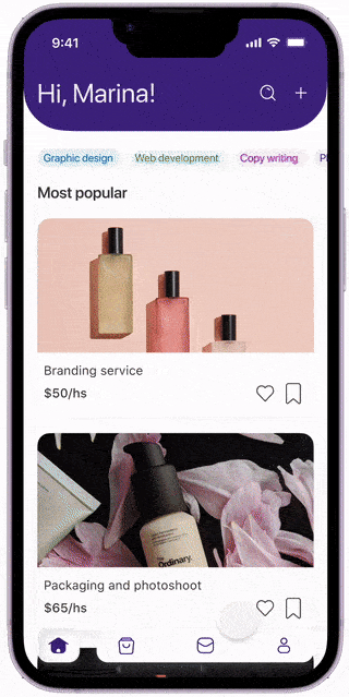
A feed-like homepage to browse portfolio posts
Differentiated profiles for customers and freelancers
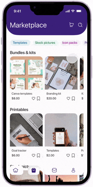
A marketplace to sell digital assets
A chat feature for easy customer communication
How can I help freelancers get more jobs and thrive in their profession, while ensuring a steady income during slow periods?
My research narrowed the scope down to these key opportunities:
Provide a unified space where portfolio and service promotion coexist.
Integrate passive revenue into the model.
Help freelancers secure new customers and communicate with them seamlessly.
With this in mind, I came up with these features for the app's MVP:
A feed-like homepage to browse portfolio posts
Differentiated profiles for customers and freelancers
A marketplace to sell digital assets
A chat feature for easy customer communication
UX phase
The main features I defined served as the foundation for a card sorting exercise that shaped the app's architecture.
I then mapped out the key user flows to ensure that users could achieve their goals efficiently and everything they needed was accounted for to avoid unwanted rabbit holes.
The main features I defined served as the foundation for a card sorting exercise that shaped the app's architecture.
I then mapped out the key user flows to ensure that users could achieve their goals efficiently and everything they needed was accounted for to avoid unwanted rabbit holes.
The main features I defined served as the foundation for a card sorting exercise that shaped the app's architecture.
I then mapped out the key user flows to ensure that users could achieve their goals efficiently and everything they needed was accounted for to avoid unwanted rabbit holes.


After some quick sketching, I moved to figma to create and prototype a first lo-fi version of the app.
Some of the questions I asked myself during this stage where
How do I make clear the difference between a customer profile and a freelancer one?
A post will work both as a portfolio post and service publication. How do I fit both this concepts in the same screen?
I had to account for more casual customers who would only go in the app for the quick purchase of digital assets, could some functionalities be accessible without authentication?
I tested the prototype with 5 users, giving special attention to the authentication, purchase, posting and profile editing flows.

UI Phase: The solution
Usability testing insight nº1
At first the app was accessible without logging in under the assumption that being able to see content immediately would increase adoption and accommodate for casual asset-buying.
However, this resulted in a lot of the offering being hidden behind log-in walls, which turned out to be frustrating for the users who ultimately preferred to quickly create an account with an identity provider, for instance.
Usability testing insight nº2
Since authentication would be required to see all the content, I simplified account creation for freelancer profile types by removing the step to complete their portfolio.
This resulted in a shorter sign up flow with a smaller drop off rate. Freelancers can now go into their profile and complete their projects in their own time.
Usability testing insight nº3
I decided to further accentuate the differences between profile types by removing unnecessary functionality from the client interface and simplifying their profile page.
Usability testing insight nº4
In the original design the search function was isolated between products or services. This generated confusion because users would try to search for both in whichever search bar they had more handy.
I unified these, so wherever you are in the app you can search for products, services or people.
Usability testing insight nº5
Buying assets used to be a feature exclusive to the client profile, but in testing I realised that freelancer's themselves found value in fellow colleague's assets for their own projects, so I decided to enable the full marketplace for the freelancer profile too.

UI Phase: The solution
Usability testing insight nº1
At first the app was accessible without logging in under the assumption that being able to see content immediately would increase adoption and accommodate for casual asset-buying.
However, this resulted in a lot of the offering being hidden behind log-in walls, which turned out to be frustrating for the users who ultimately preferred to quickly create an account with an identity provider, for instance.
Usability testing insight nº2
Since authentication would be required to see all the content, I simplified account creation for freelancer profile types by removing the step to complete their portfolio.
This resulted in a shorter sign up flow with a smaller drop off rate. Freelancers can now go into their profile and complete their projects in their own time.
Usability testing insight nº3
I decided to further accentuate the differences between profile types by removing unnecessary functionality from the client interface and simplifying their profile page.
Usability testing insight nº3
I decided to further accentuate the differences between profile types by removing unnecessary functionality from the client interface and simplifying their profile page.

Usability testing insight nº4
In the original design the search function was isolated between products or services. This generated confusion because users would try to search for both in whichever search bar they had more handy.
I unified these, so wherever you are in the app you can search for products, services or people.
Usability testing insight nº4
Buying assets used to be a feature exclusive to the client profile, but in testing I realised that freelancer's themselves found value in fellow colleague's assets for their own projects, so I decided to enable the full marketplace for the freelancer profile too.
Usability testing insight nº4
Buying assets used to be a feature exclusive to the client profile, but in testing I realised that freelancer's themselves found value in fellow colleague's assets for their own projects, so I decided to enable the full marketplace for the freelancer profile too.

UI Kit
I wanted the app to evoke creativity and inspiration, while also giving a sense of trustworthiness and quality. To achieve this, I decided to use purple and blue as my main and secondary colours, and included a gradient for the more decorative elements.
Since this is a native iOS app I used SF Display and SF text as my fonts, and made some custom illustrations for the onboarding, posting and check out flows.

Key takeaways
This was my first time working on research and design for a digital product
I learnt about the different processes and methods available to successfully deliver a mobile application, from research options available to technical constraints and requirements for native IOS apps.
I learnt about the different processes and methods available to successfully deliver a mobile application, from research options available to technical constraints and requirements for native IOS apps.
I learnt about the different processes and methods available to successfully deliver a mobile application, from research options available to technical constraints and requirements for native IOS apps.
Research methods matter
Looking back, I wish I had focused less on benchmarking and desktop research and had instead interviewed users on the research phase of this project. I feel like introducing their feedback only in the testing phase was a tad late, and a lot of what they expressed at that point could've been dealt with before had I asked.
Looking back, I wish I had focused less on benchmarking and desktop research and had instead interviewed users on the research phase of this project. I feel like introducing their feedback only in the testing phase was a tad late, and a lot of what they expressed at that point could've been dealt with before had I asked.
Looking back, I wish I had focused less on benchmarking and desktop research and had instead interviewed users on the research phase of this project. I feel like introducing their feedback only in the testing phase was a tad late, and a lot of what they expressed at that point could've been dealt with before had I asked.
The simplest solution is the way to go.
Not only does this apply to aesthetics and the design itself (the UI you see here is not the original one, I went back to it repeatedly over the years, this being the latest iteration) but the project was huge, and it included two completely different apps for each one of my user profiles. Upon testing and revision I realised that, no amount of pride for creating something that complex could take precedence over simplicity and ease of use, not only for the users but also when thinking of a hypothetical dev hand off.
Not only does this apply to aesthetics and the design itself (the UI you see here is not the original one, I went back to it repeatedly over the years, this being the latest iteration) but the project was huge, and it included two completely different apps for each one of my user profiles. Upon testing and revision I realised that, no amount of pride for creating something that complex could take precedence over simplicity and ease of use, not only for the users but also when thinking of a hypothetical dev hand off.
Not only does this apply to aesthetics and the design itself (the UI you see here is not the original one, I went back to it repeatedly over the years, this being the latest iteration) but the project was huge, and it included two completely different apps for each one of my user profiles. Upon testing and revision I realised that, no amount of pride for creating something that complex could take precedence over simplicity and ease of use, not only for the users but also when thinking of a hypothetical dev hand off.